

Role
Product Designer
Contribution
100%
Team
1 Product Designer
1 Product Manager
1 Tech Lead
3 Engineers
Project Duration
3 Months
Facebook Marketplace is Facebook’s C2C service where users can buy and sell secondhand goods directly with one another. As Gen Z and Millennials have increasingly shifted away from luxury and high-end brand consumption toward more value-conscious spending and purchases aligned with their personal values, Marketplace has emerged as a powerful channel for attracting young adults to Facebook.
In fact, it has become the second most important reason young adults join Facebook.
Facebook is increasingly perceived as a platform for older generations—parents, uncles, and grandparents. Once the dominant social platform, Facebook is now focused on attracting and engaging young adults (18–29) to break this perception and drive long-term growth.
Young adults are a critical audience for shaping future user habits. They use social media for content discovery, shopping, and entertainment, and often adopt new features and trends early—making them an important driver of platform growth and innovation.

There are many ways users discover and enter Marketplace.
These range from external messaging and link sharing to organic discovery across Meta’s ecosystem, creating multiple touchpoints that bring users into Marketplace.

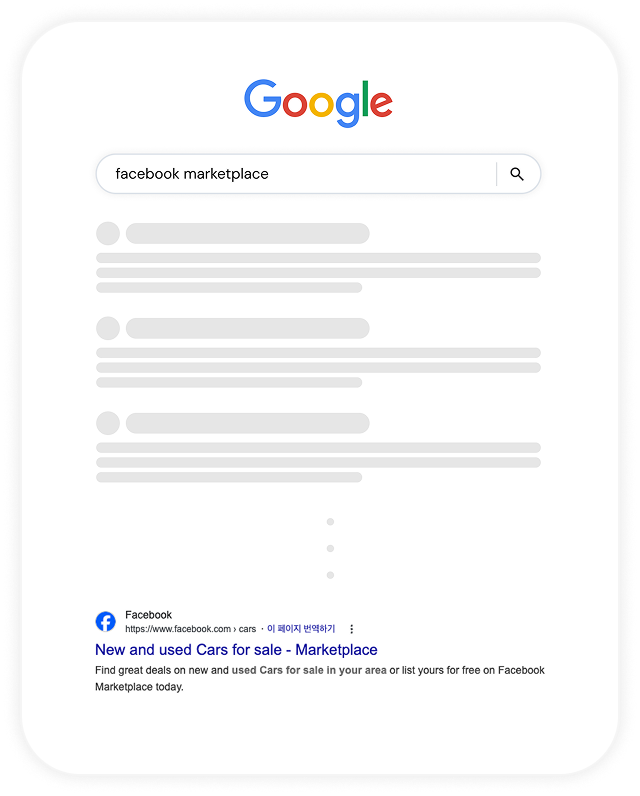
Among these channels, we saw a strong opportunity in search.
When users have a specific need, such as finding a secondhand item,
they often turn to search engines before opening an app. For example, they might search for

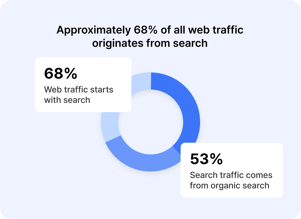
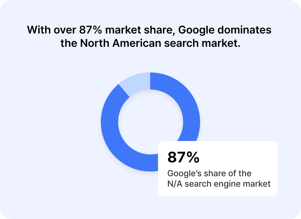
Desk Research
SEO is a high-potential acquisition channel that can attract both new and returning users.
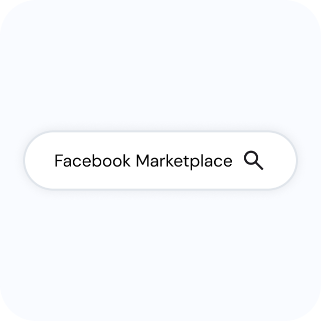
Marketplace has a strong local product offering and high brand awareness, with many users searching for it directly on Google. This has helped Marketplace lead the C2C market.
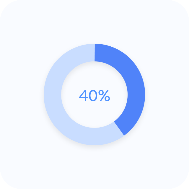
Approximately 40% of search-driven sessions come from logged-out users, highlighting search engines as a key growth engine for naturally bringing new users to Facebook.
Despite its strong brand awareness and search potential, Marketplace was underperforming in search rankings, limiting its ability to convert users.
When users searched for secondhand-related keywords, Marketplace appeared in the top 10 results only 17% of the time—a stark contrast to the high potential identified in our earlier research.

Marketplace is the second-highest converting touchpoint for sign-ups and logins across Facebook products, second only to the login page.
Problem
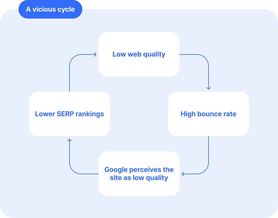
Even the most robust data work can’t drive sustainable traffic if the user experience is broken.
At the time, the engineering team prioritized data optimization on WebLite, a lightweight platform designed to improve crawling efficiency by minimizing UI elements. However, WebLite’s usability fell short of modern web standards, leading to high user drop-off and signaling to Google’s bots and crawlers that the pages offered low value. This, in turn, hurt search rankings.
Ultimately, well-structured data means little without a user experience that can effectively deliver it.
Goal
The goal of the redesign was to keep users who arrived through search engaged on Marketplace.
By reducing bounce rates and increasing time spent on the site, we could improve Google’s perception of the pages and, ultimately, their search rankings. Higher rankings would then drive more traffic, turning the vicious cycle into a virtuous one.
We decided to track this impact through SSP ranking and US/CA aDAU.
Before
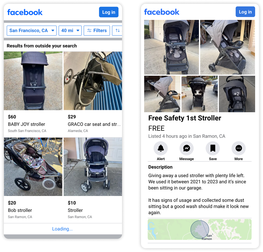
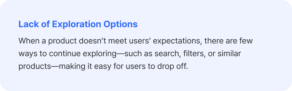
Key Problems with the Existing Design

After
Rebuilding trust with up to date UI
For users arriving through SEO, the landing page is their first impression of the service. If that first impression feels untrustworthy, they may drop off before reaching key conversion points like logging in or sending a message.
To build trust, we updated the web UI to align closely with the latest app design system. This created a more consistent experience for existing users while lowering the barrier to adopting the app for new users.
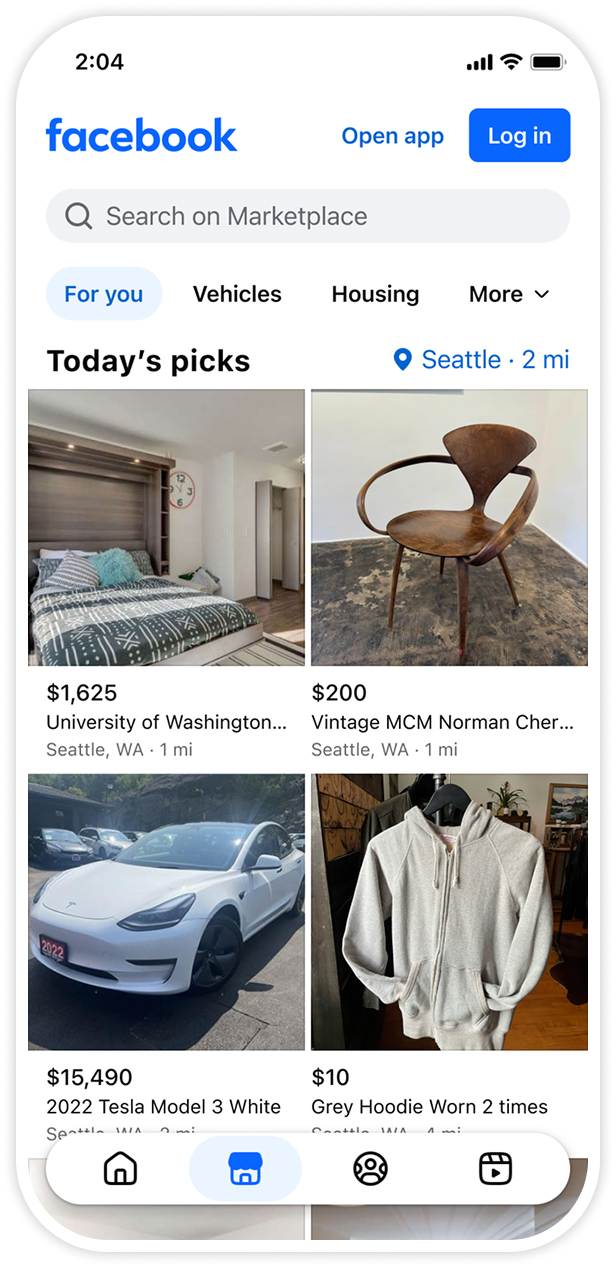
For users without an account,
trust is a key driver of conversion.
Expanding Navigation Paths
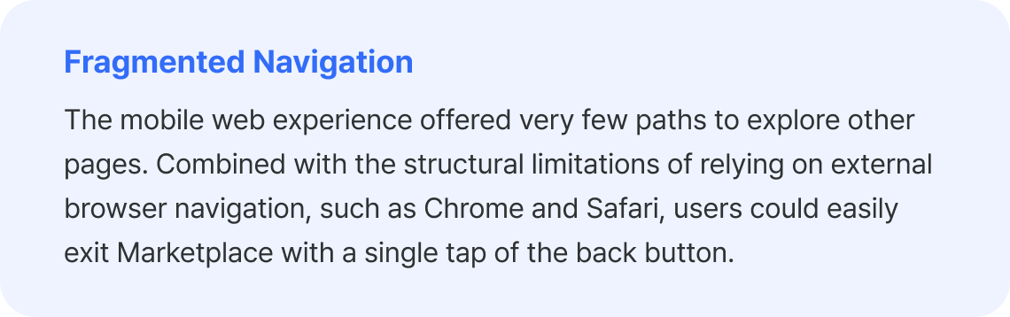
Because the mobile web experience relied heavily on external browser UI, users could easily leave the service with a single tap of the back button. We introduced in-product breadcrumbs and a navigation bar, allowing users to move freely within Marketplace instead of relying on the browser’s navigation.
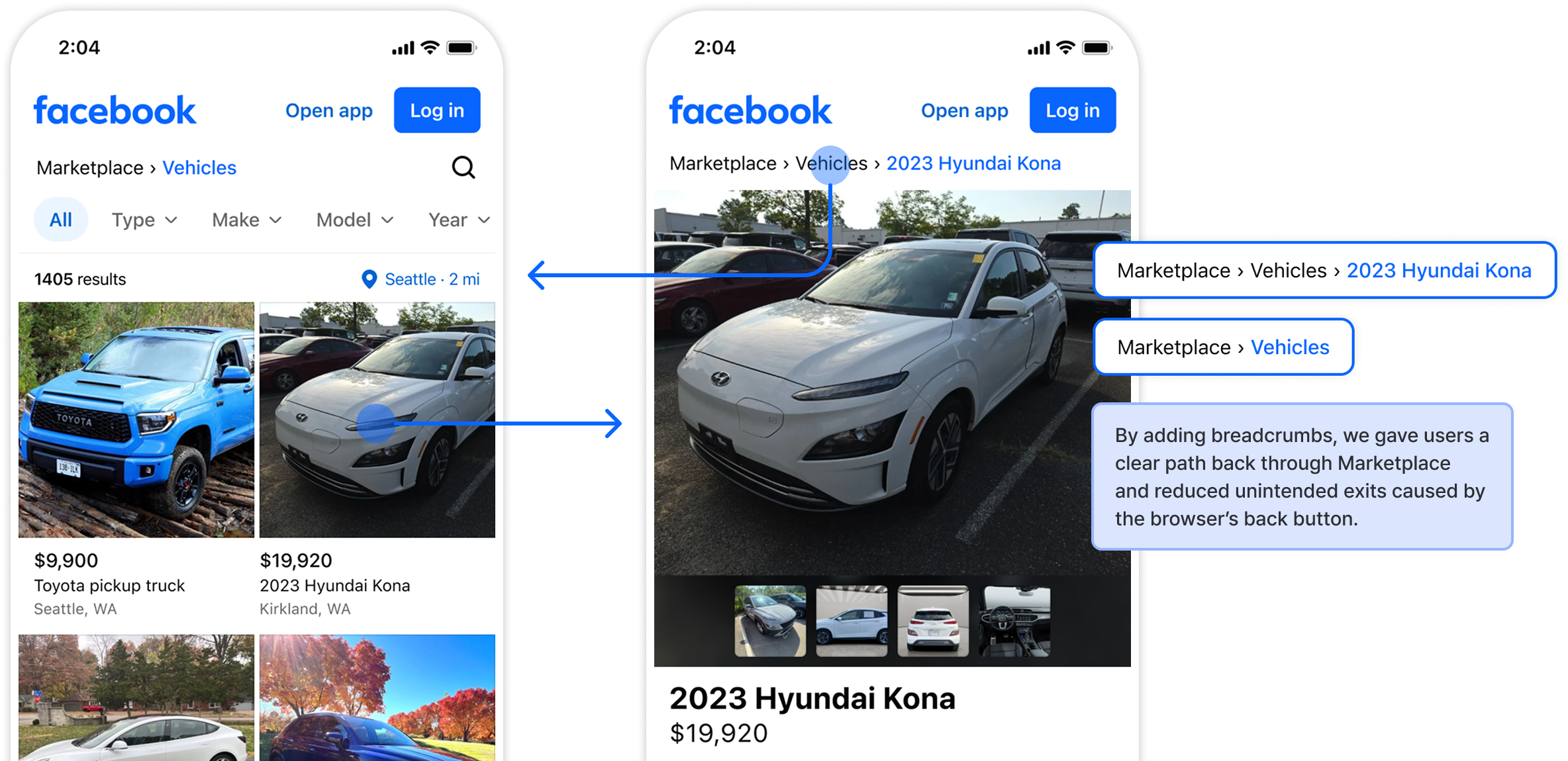
Smoother navigation within Marketplace
Expanding the Exploration Experience
We redesigned two key exploration features to help users continue browsing within Marketplace, even when a product doesn’t meet their expectations.
1. Search
We made search accessible throughout the Home and Category pages, allowing users to search for something new at any point in their journey. We also added filters to search results, helping users quickly narrow down to the products they’re looking for.
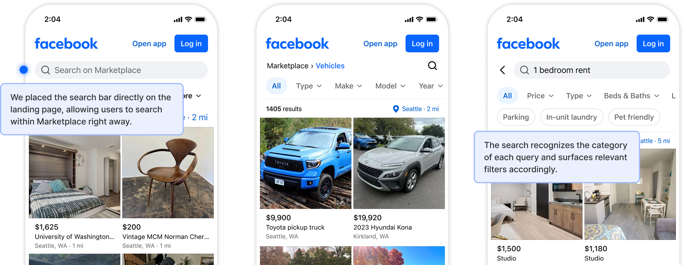
2. Filters
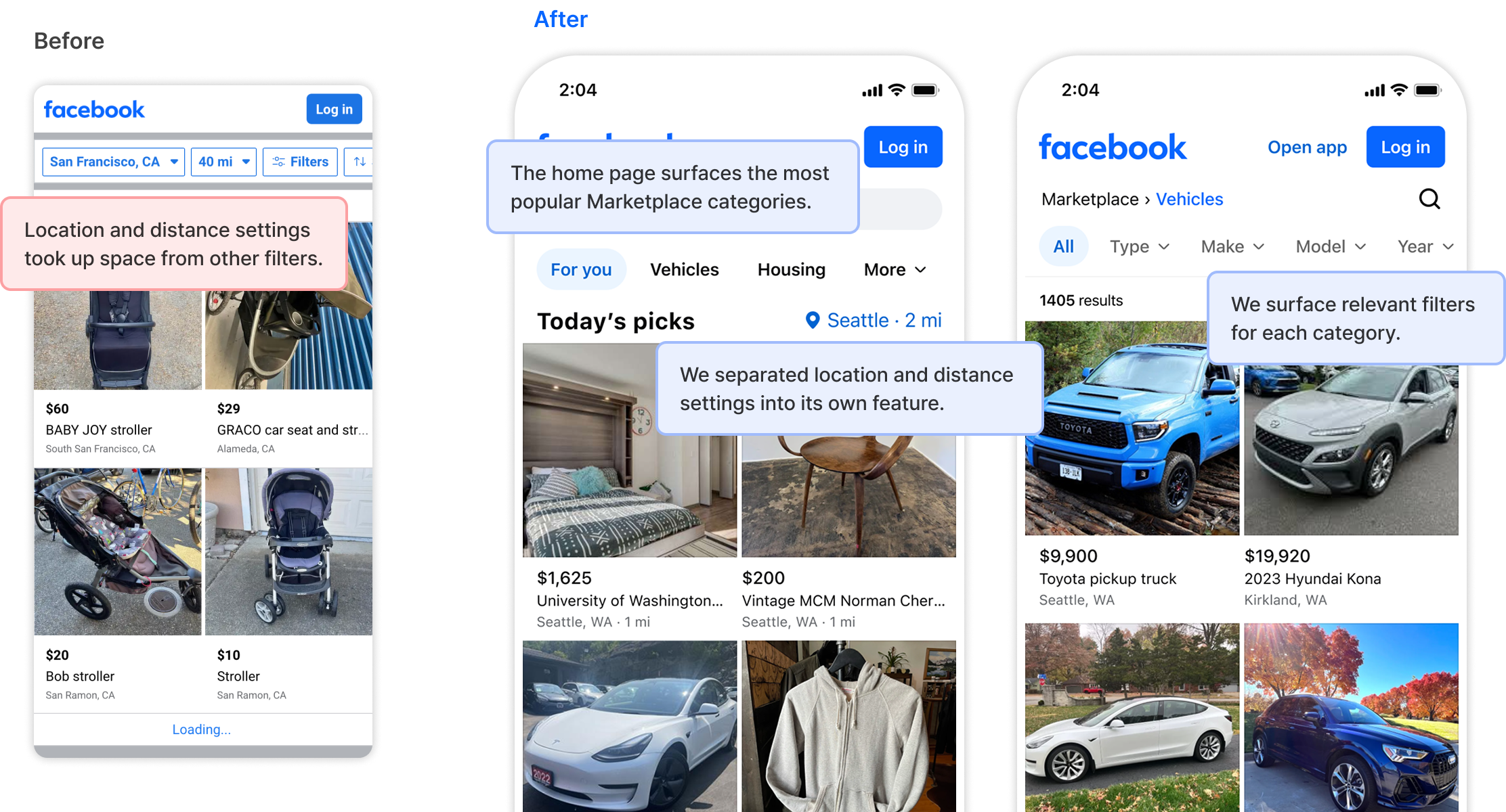
We separated location and distance settings into a dedicated component so they wouldn’t take up space needed for other filters.
We also prioritized filters and categories based on the user’s browsing context, encouraging them to continue exploring.
Impact
Four UX improvements—back button, search, filters, and UI redesign—were each tested as independent experiments. We split traffic between the new and existing experiences, then worked with the Data Engineering team to validate SSP ranking changes for experiments that showed a significant reduction in bounce rate. Successful improvements were rolled out sequentially.