Content Detail Page Revamp
Mobile | 39.85% uplift in playback conversion
Role
Product Designer
Contribution
100%
Team
1 Product Owner
1 Product Designer
1 iOS Engineer
1 AOS Engineer
Project Duration
5 months
CDP revamp objectives include
Show users important information
Show users attractive information
Expose users to more content details
Problem
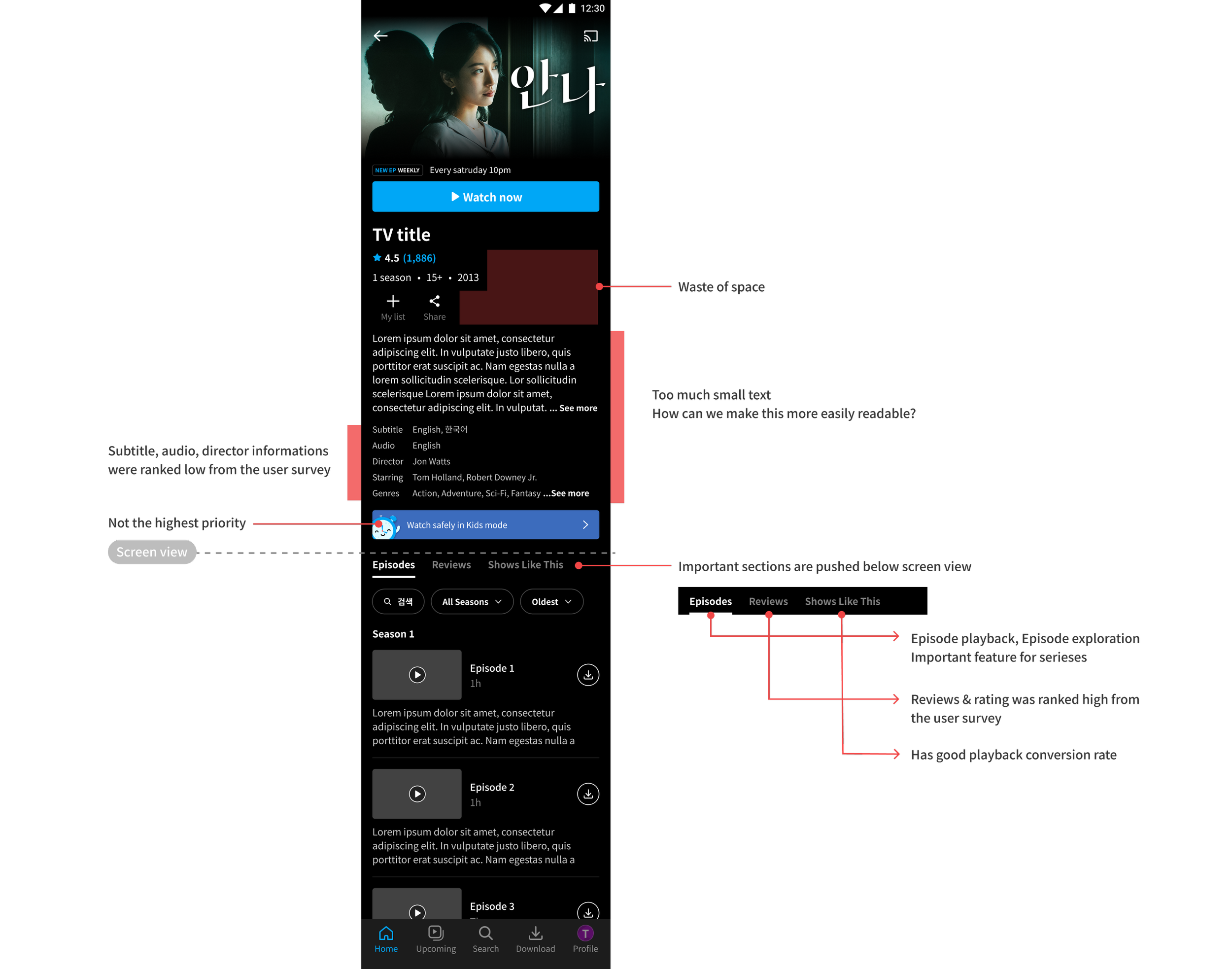
Current structure does not meet variety of users’ needs
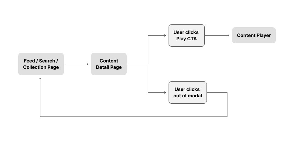
When users land on the CDP, the first things they see are the player, CTA, metadata, synopsis, director, casting, subtitles, dubbing, and genres. Half of this information is not what the user is looking for.
Users coming from search, my list and continue watch already has good context on the contents and has strong intention to playback.
Users who doesn’t have strong intention to playback needs appealing information that would engage them to playback
Users who wish to purchase TVOD aren’t able to see all purchase options or discounts to make the best purchase
Information are difficult to read
Page is lacking in visual hierachy and information hierachy
There are too much text in same text style and its difficult for users eyes to consume information
Is not flexible nor scalable to support upcoming new business needs
Current structure is ineffective to add new features since there are too many informations concentrated at the top of the page. There are no space and adding new components would push down the tabs further down and complex.
New features such as channel subscription, TVOD, ticket purchase, group watch, event CTA and other potential new features do not have a space
Design Goal
Reprioritising information and adjusting visual emphasis to sell the content in a compelling manner
Improve the structure of CDP to be able to scale to meet different user and business needs
Create a visual CDP which can set the mood and provide the most critical information at a glance
Create a CDP that is highly aware of what context users expect at different stages of discovery and watch status
Trade-offs
Some meta data or informations will be pushed down
Some meta data or informations will be hidden, creating second depth
It might take longer time for users to find the less important information and what information is considered important is different by users.
Hypothesis
If we redesign the information to have better readability by
organizing infos to be displayed in proper hierachy
designing the informations to be easy to read and visually appealing
it will be easier for users to consume information and help them make decisions
If we create a summary page where we can rearrange the informations to be in order of impact, importance and users’ preference, it will sell the content better
Design Strategy : Mobile
1.Improve Structure
Pushed down the synopsis and other detail information
Allowed other important features’ entry point to be more visible
Added new features that needs to live in CDP
Users can now see the entry point of relevant informatioin and features up on lnading
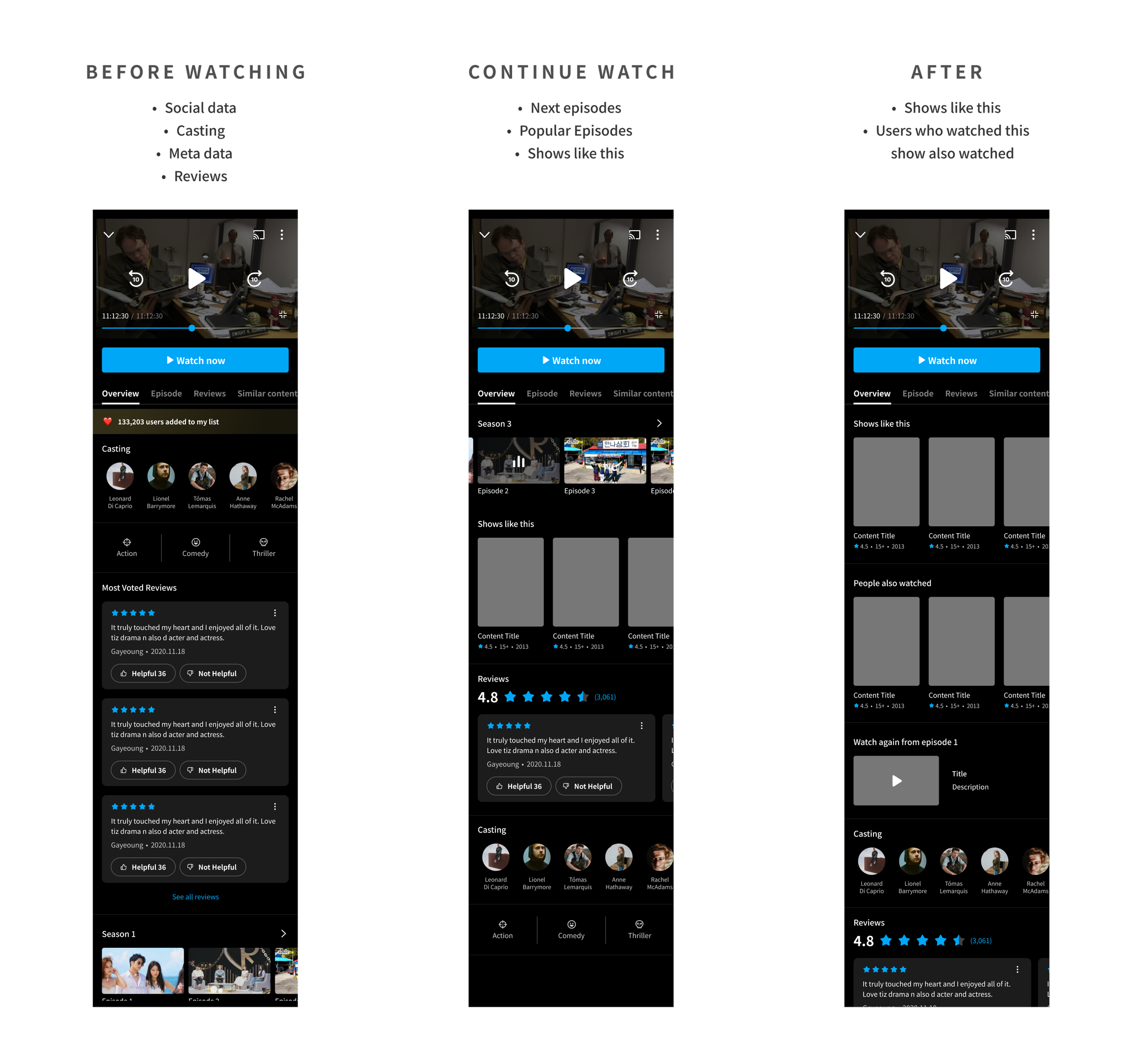
2. Create an overview tab that displays different information in different cases
Users can passively gain impression on the information and functions they need in each following cases
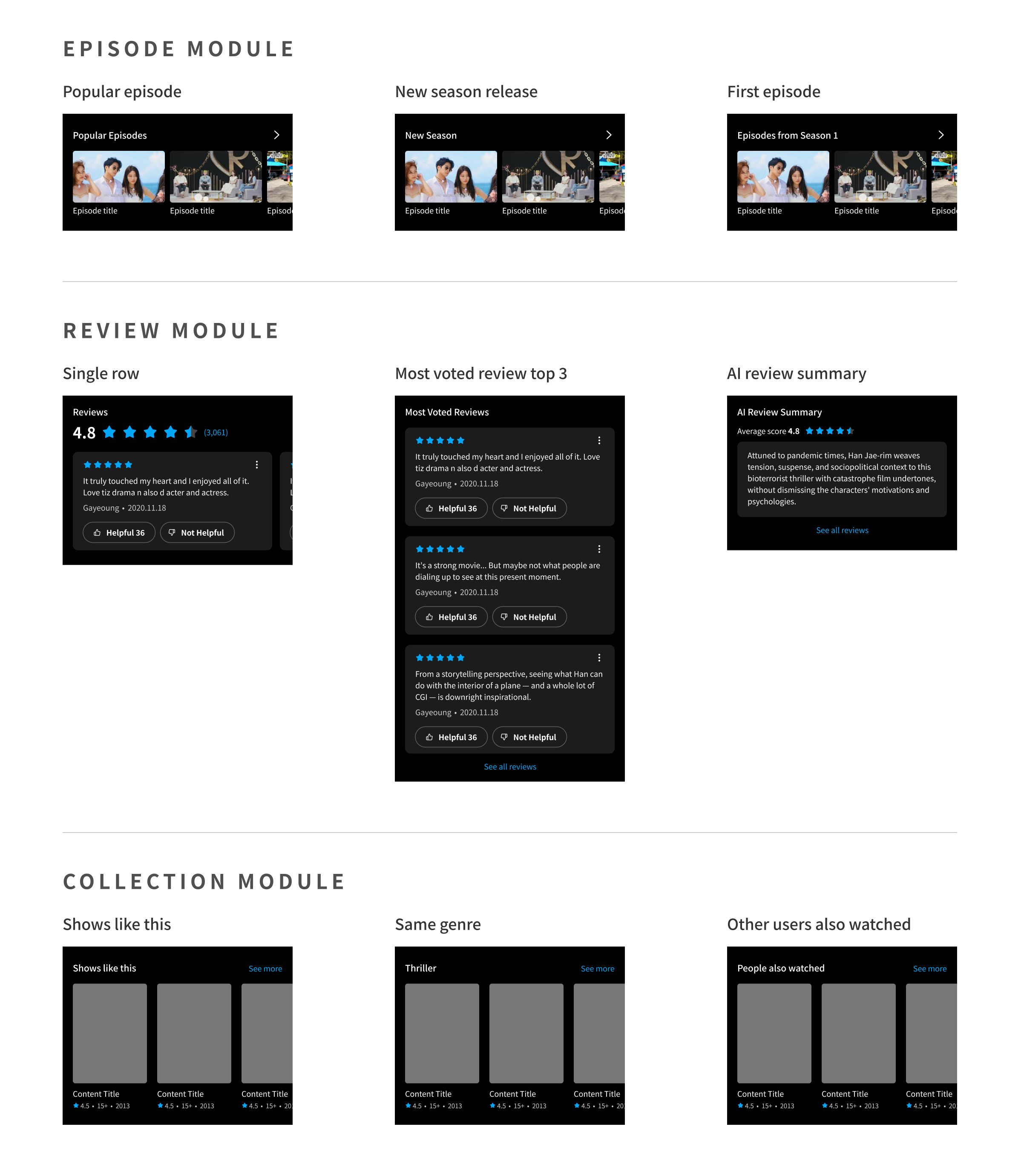
3. Explore different modules and personalize
Test different module types and designs on different user groups and use cases.
Create dynamic feed that is curated with personalized modules to display information that matters the most to individual users
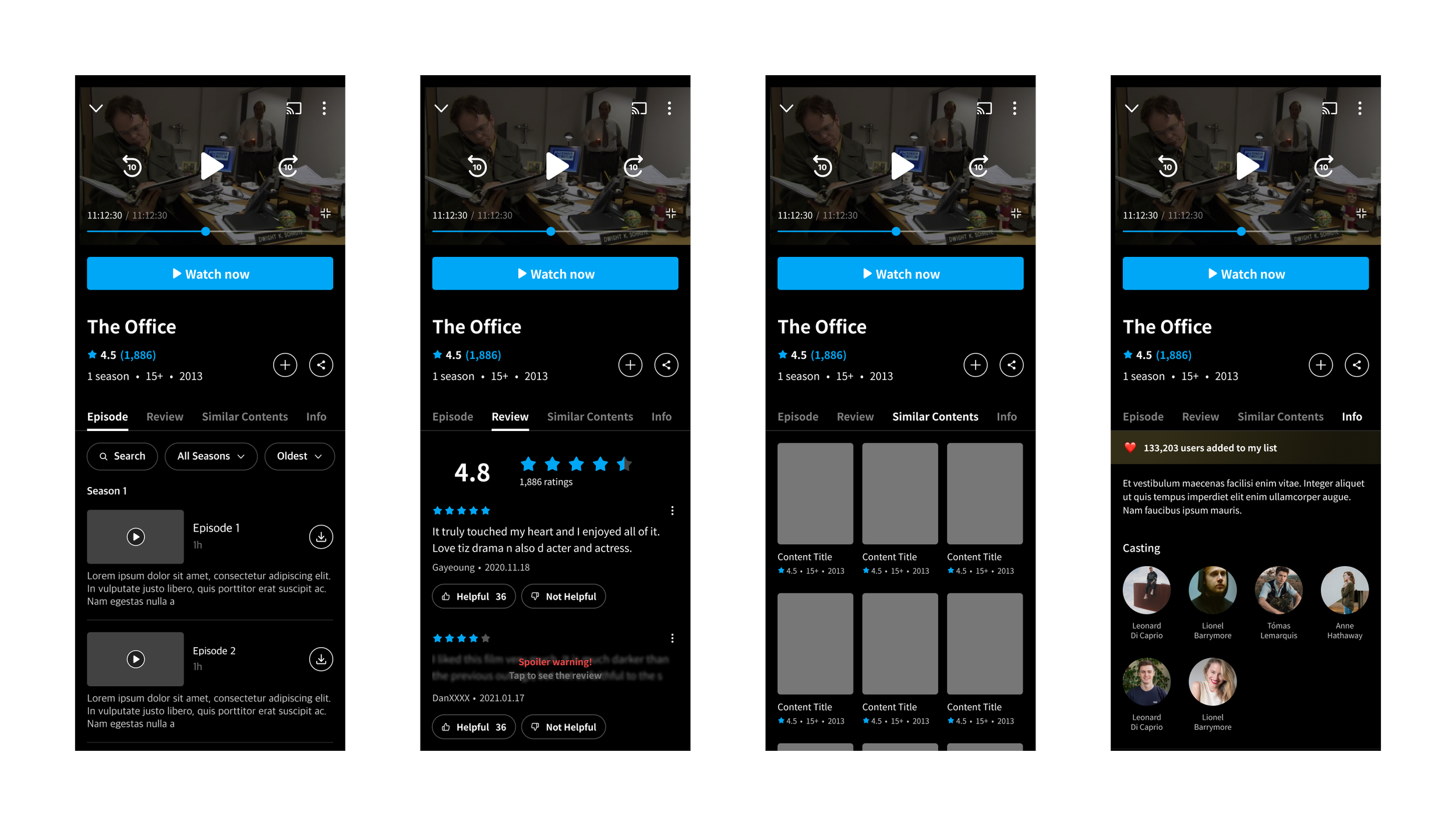
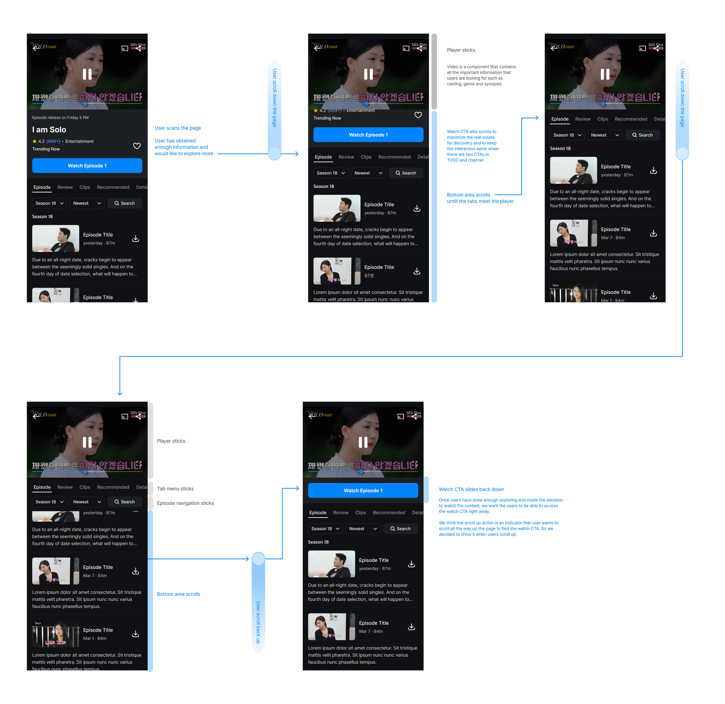
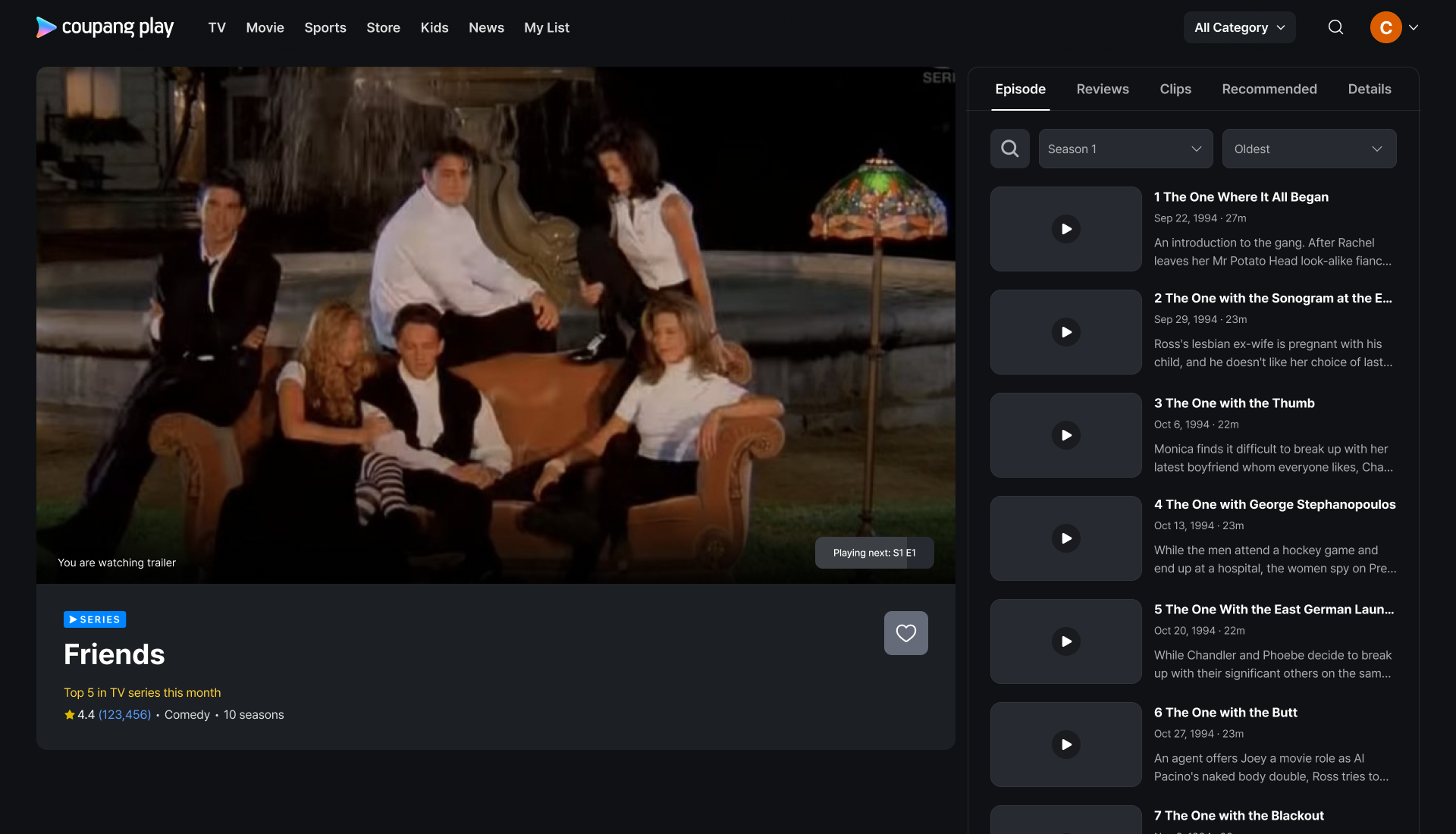
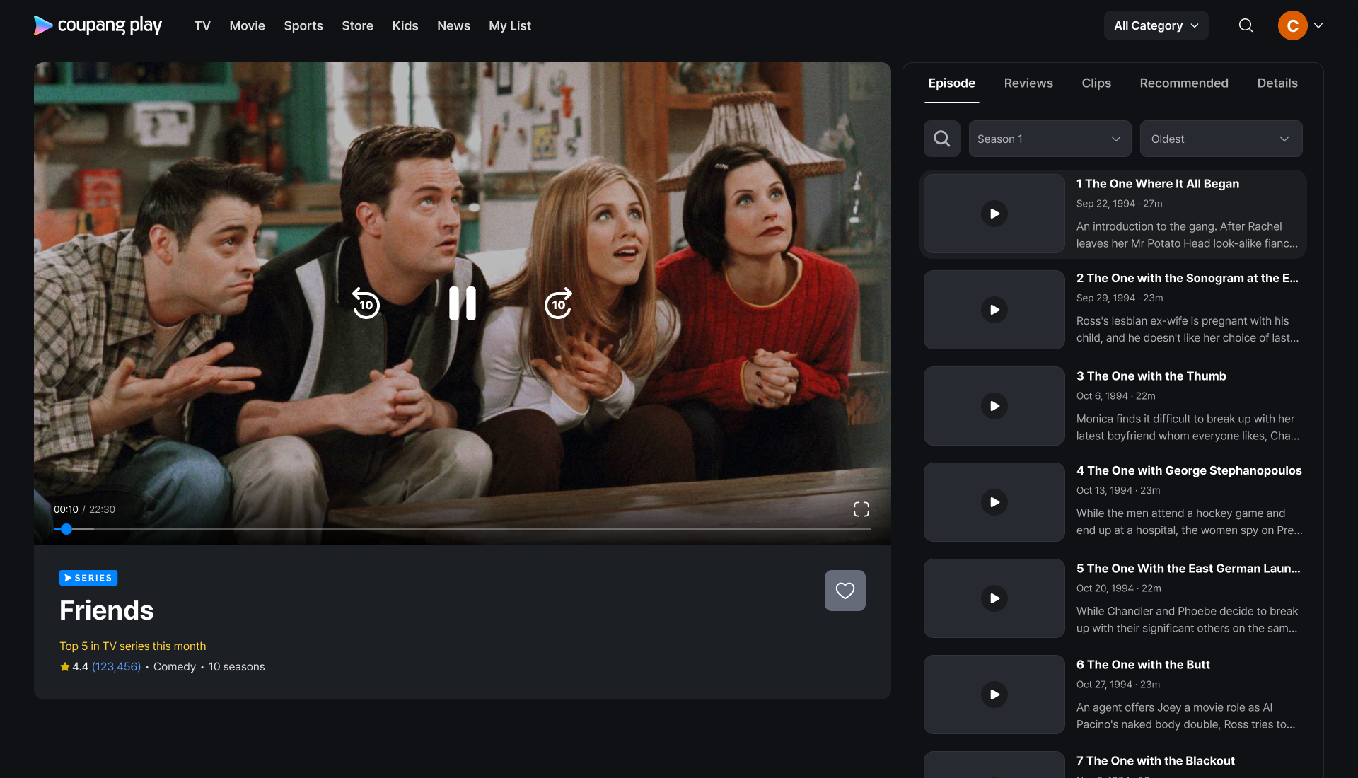
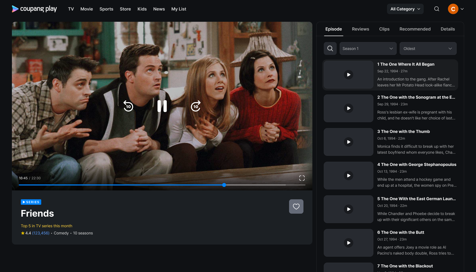
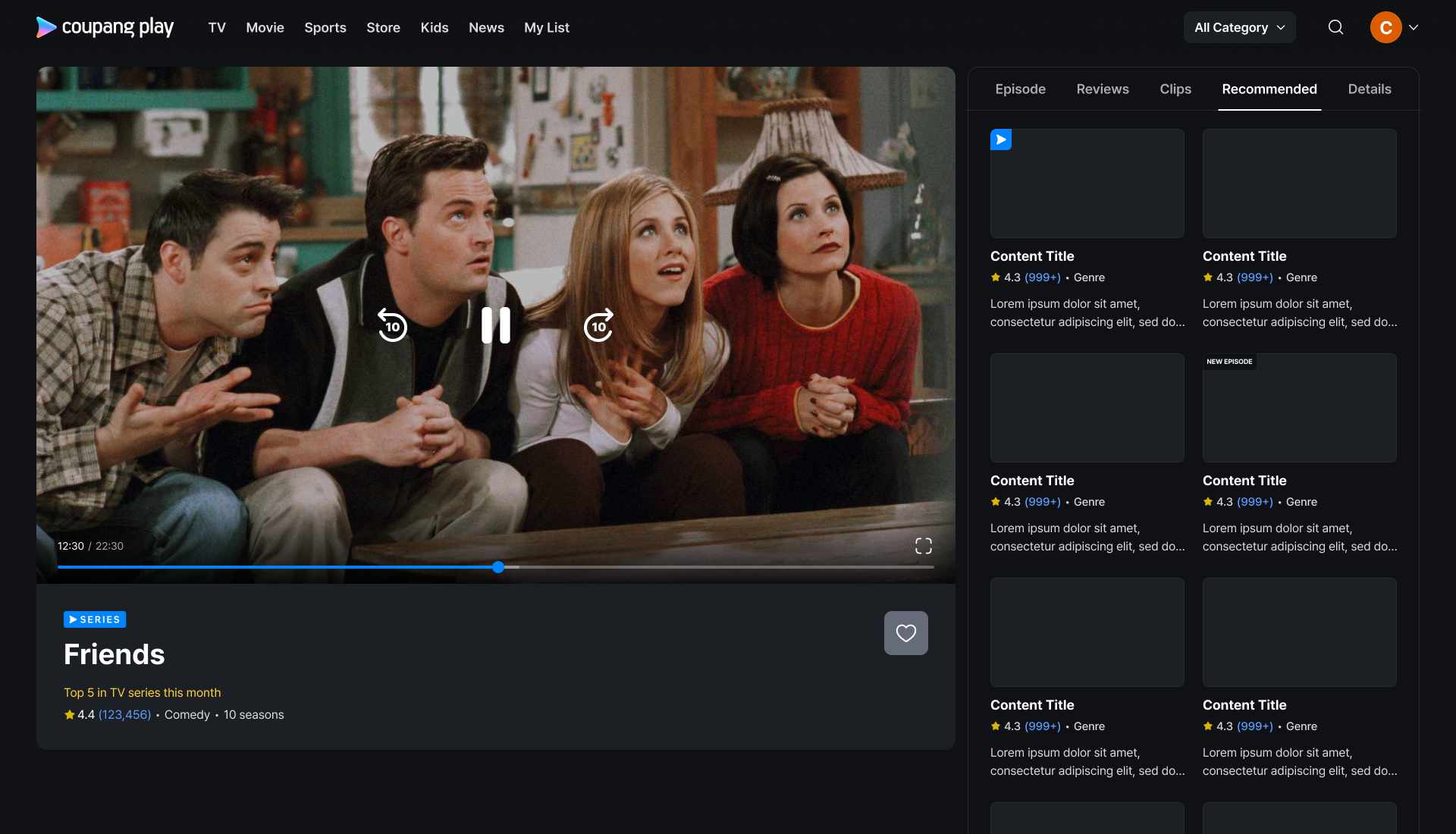
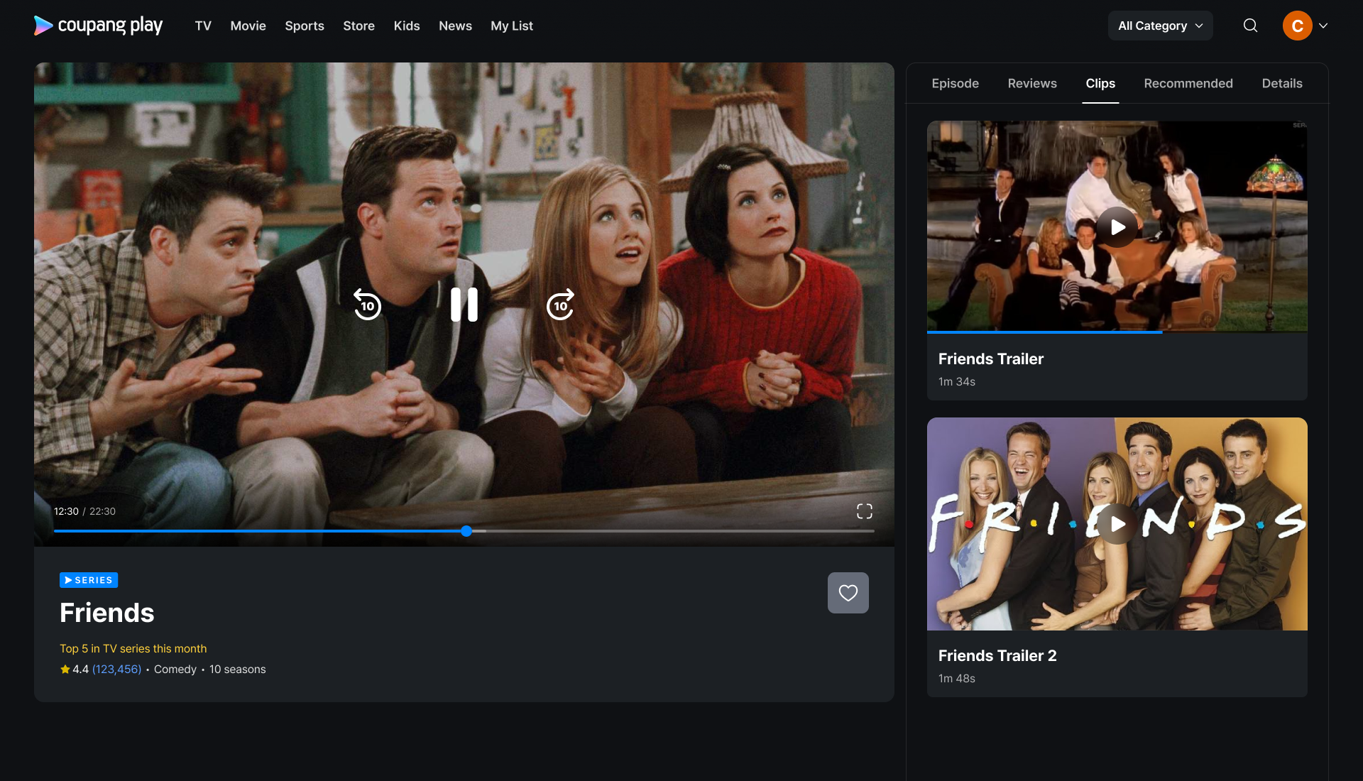
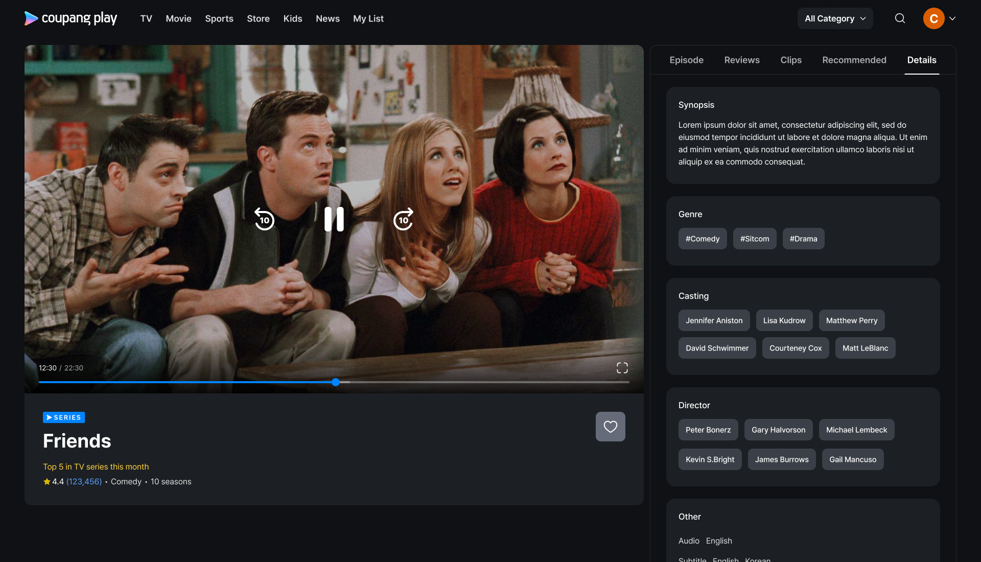
Final Design : Mobile
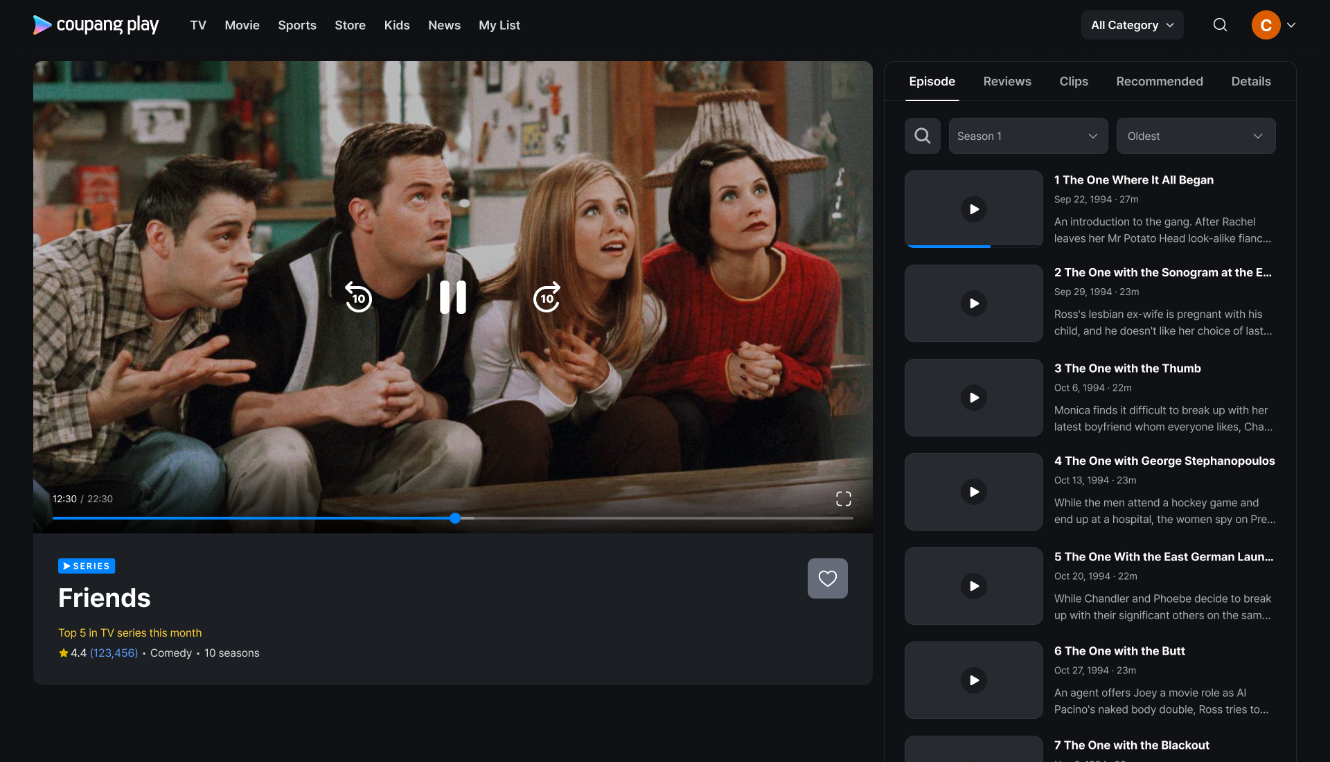
Series

Scroll Interaction
Movie
TVOD
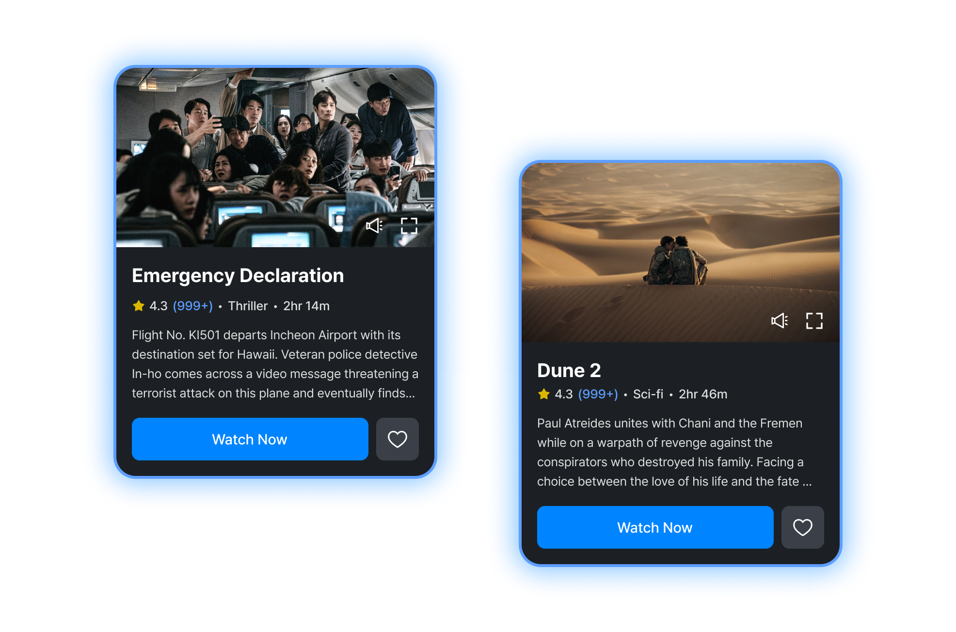
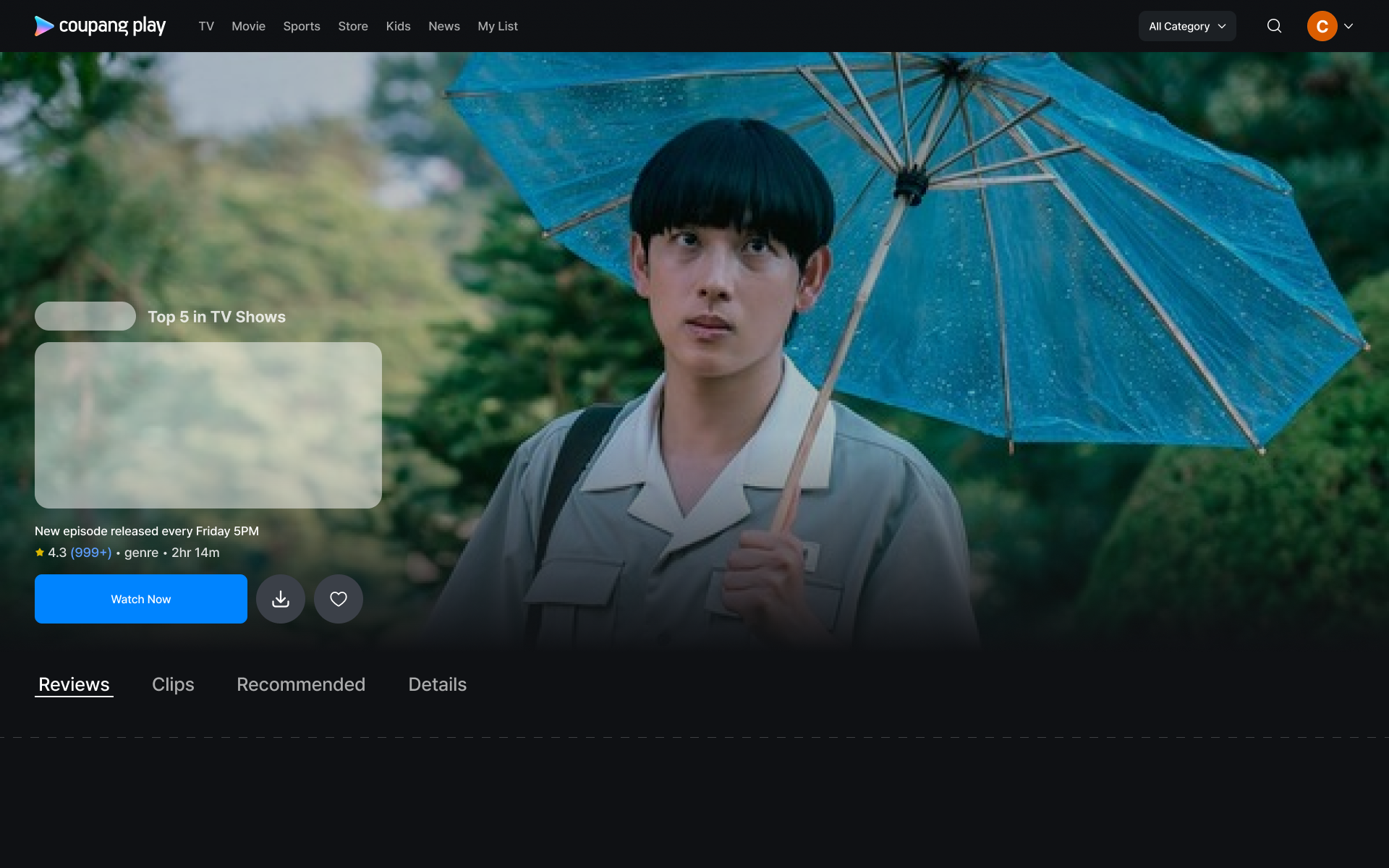
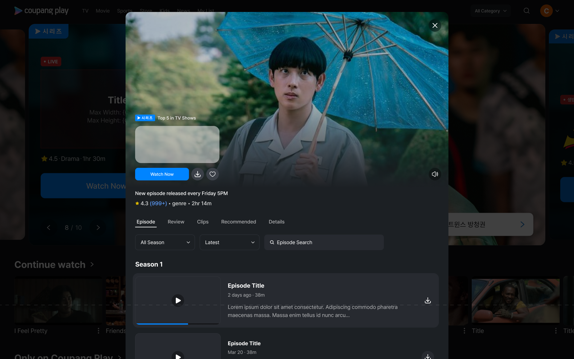
Important information such as original series badge, new episode release day and coupon are located as header caption
Removed all the other less important information to bring up the CTA. All the detailed information can be found under the details tab. Simplified the data to point out how the content is rated by others, what genre it is and if it is a movie or not by the running time
Now there are more space for extra button cases such as discount coupon and upcoming channel business
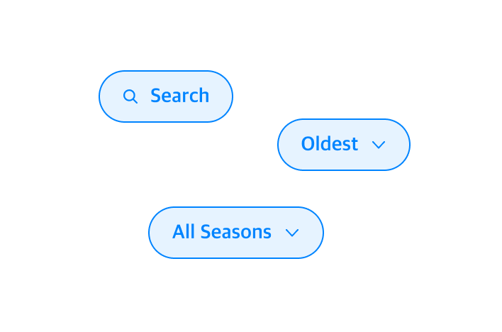
Tabs are now clearly visible in screenview up on users’ landing. Users now have impression on tab and access tabs they want to see to find out more about the show
The content detail page is a page where many pieces of information exist. The device screen view is limited space, and it is important to utilize it effectively. We wanted to maximize the space where users can explore information. Here are some of the ideas behind how we controlled the space by using scroll interaction.
Impact
New design drove 39.85% uplift in playback conversion and
uplifted 6.23% playback action per customer
Design Strategy : Web
Before taking a look in to web design, we found an interesting data and I translated the data as below…
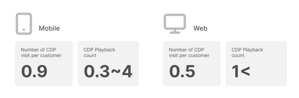
Mobile
Users are visiting CDP more but playback conversion is lower. Due to the nature characteristics of mobile device, users are moving around more and distractions happen in the same device, which causes lower commitment to play.
Web
Users are visiting CDP less but playback conversion is higher. Due to the nature characteristics of desktop/laptop device, users are at an environment where they can sit back and lay down before watching. Users can even play the content in the background even when there are distractions which means its less of a burden to play something from large screens.
1. Amazon Prime, Disney + , Wavve, TVing, style structure
This structure enables the display of the trailer in the largest possible size. We have always regarded video as one of the most crucial elements that convey the most information about content. Without needing to read anything, users can discern the casting, genre, mood, and a brief synopsis of the content.
However, beyond this, we are still unable to showcase other significant elements such as episodes and similar content, which are as important as the video trailer. Additionally, the location of the menu tab has not seen significant improvement, and the contents under each tab are not immediately visible upon landing.
I conducted a competitor research and analysis, found three different structures being used by other platforms. I applied our product in to these three different structures to see which direction our service suited the best
3. Youtube style structure
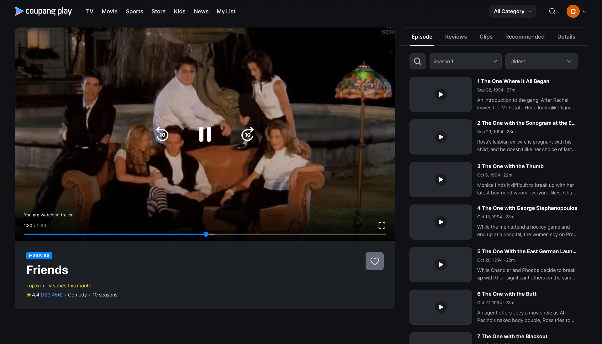
Users can immediately start watching content with the small player and switch to the full player when they wish to focus more intently on the content. Unlike other designs, this structure reduces the steps and barriers for users to begin playing content. Without needing to fully commit to entering the full player, users can easily continue to play subsequent content.
This design aligns well with the data analysis mentioned earlier, and our hypothesis is that once users enter the CDP, they are more likely to naturally continue watching the auto-played content, contributing to an increase in overall playtime, which is one of the main key metrics that is challenging to improve.
The addition of a side tab and auto-play feature also works well for sports event pages, as sports matches include live streaming, highlights, live chats, and stats. However, it may not be the best fit for TVOD or Channels where users must complete a transaction before watching.
2. Netflix style structure
This structure presents content details in a modal page style. Although the video size is smaller, the narrower page layout enables us to position the menu tab higher, allowing the information beneath the tab to be immediately visible upon the user's arrival.
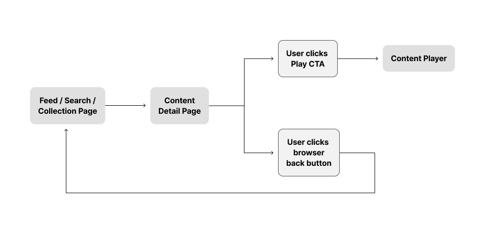
To enter and exit the CDP, the number of click interactions remains the same as in structure #1. However, the UI design, which displays the previous page beneath a dark overlay, allows users to click the background area to easily exit the CDP without needing to use the browser's back button. This structure facilitates a more user-friendly browsing experience within the CDP.
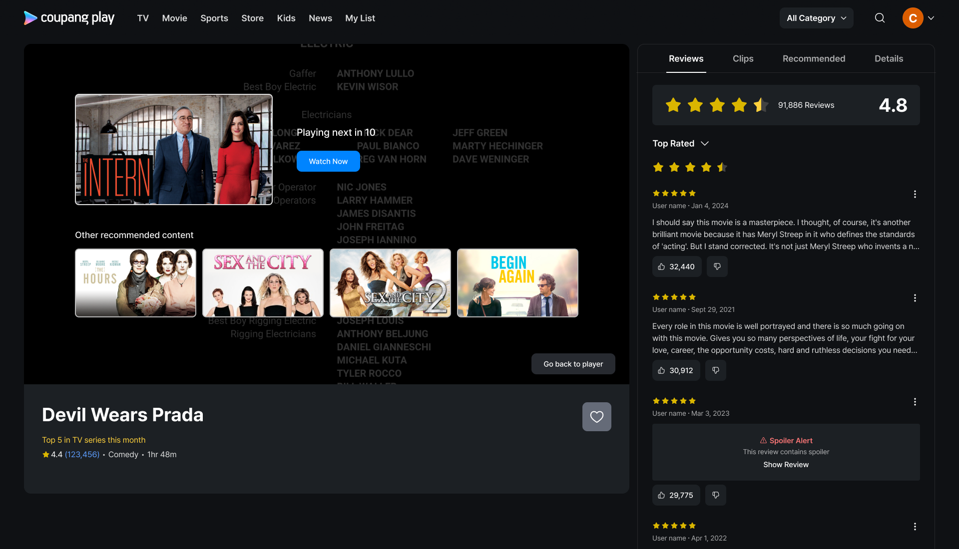
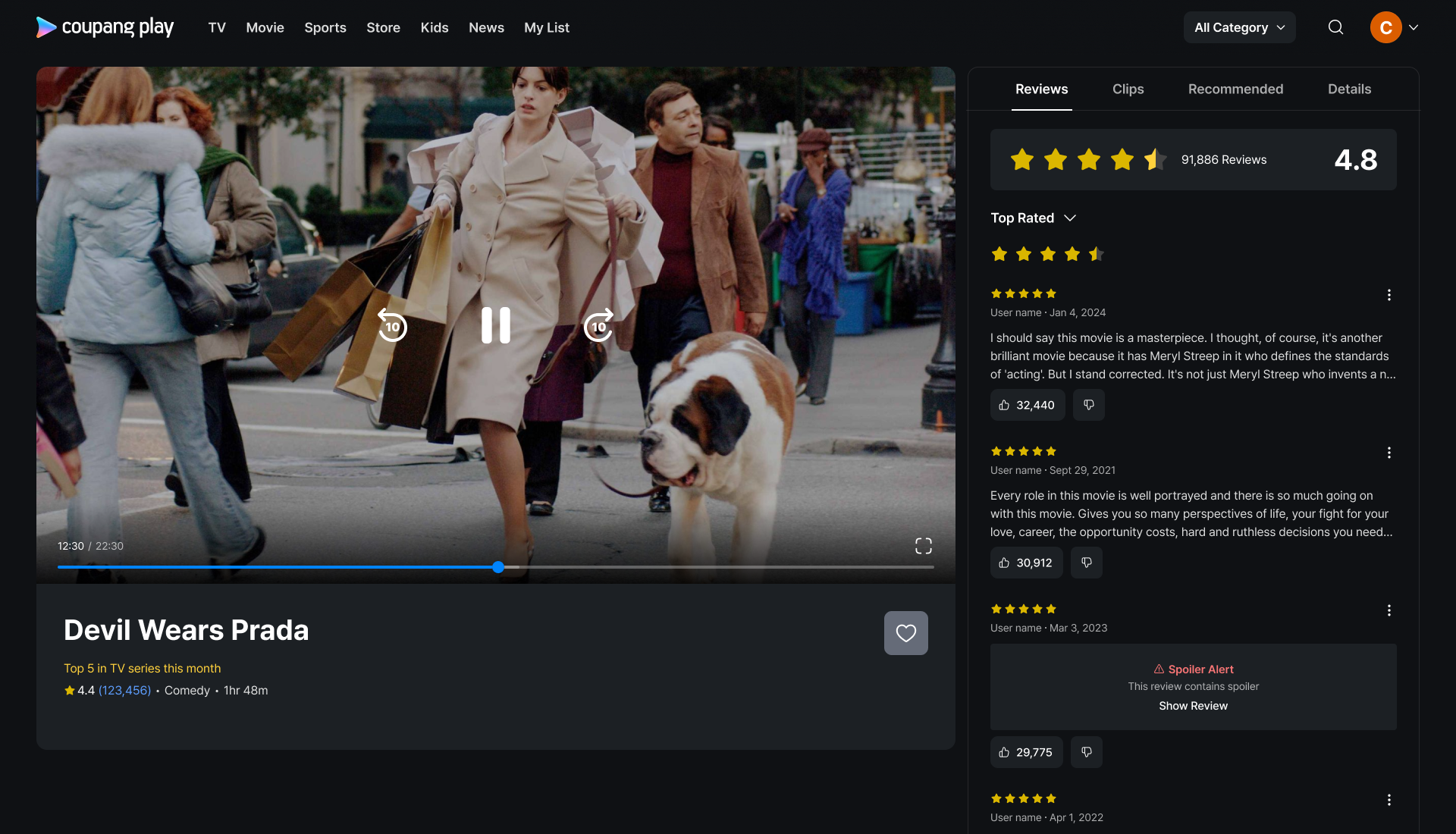
Final Design : Web
In conclusion, we decided to adopt structure #3. This structure simplifies the process for users to begin playing content and facilitates seamless content discovery should they lose interest. Previous research from other projects has shown that users often watch a few minutes of content before deciding whether to commit to watching it in its entirety. Overall, we concluded that structure #3 offers the best user experience for watching content.
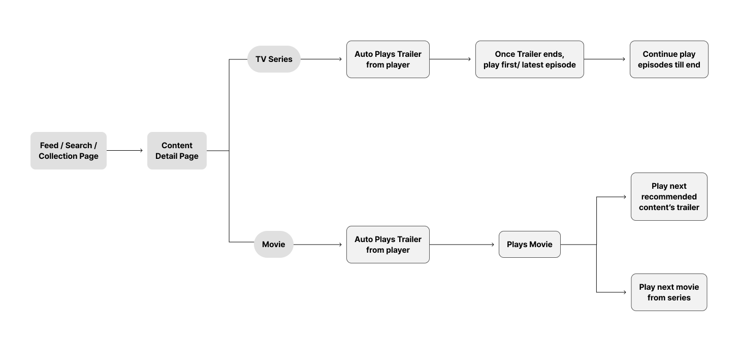
When user has never watched the content before
When user has been watching the content
When user has completed watching the content
Player shows next content that is going to play. Not to force users to play one thing, we can provide other recommendations to play.
We wanted to A/B test which design better performs to increase the playback coming from content detail page player.
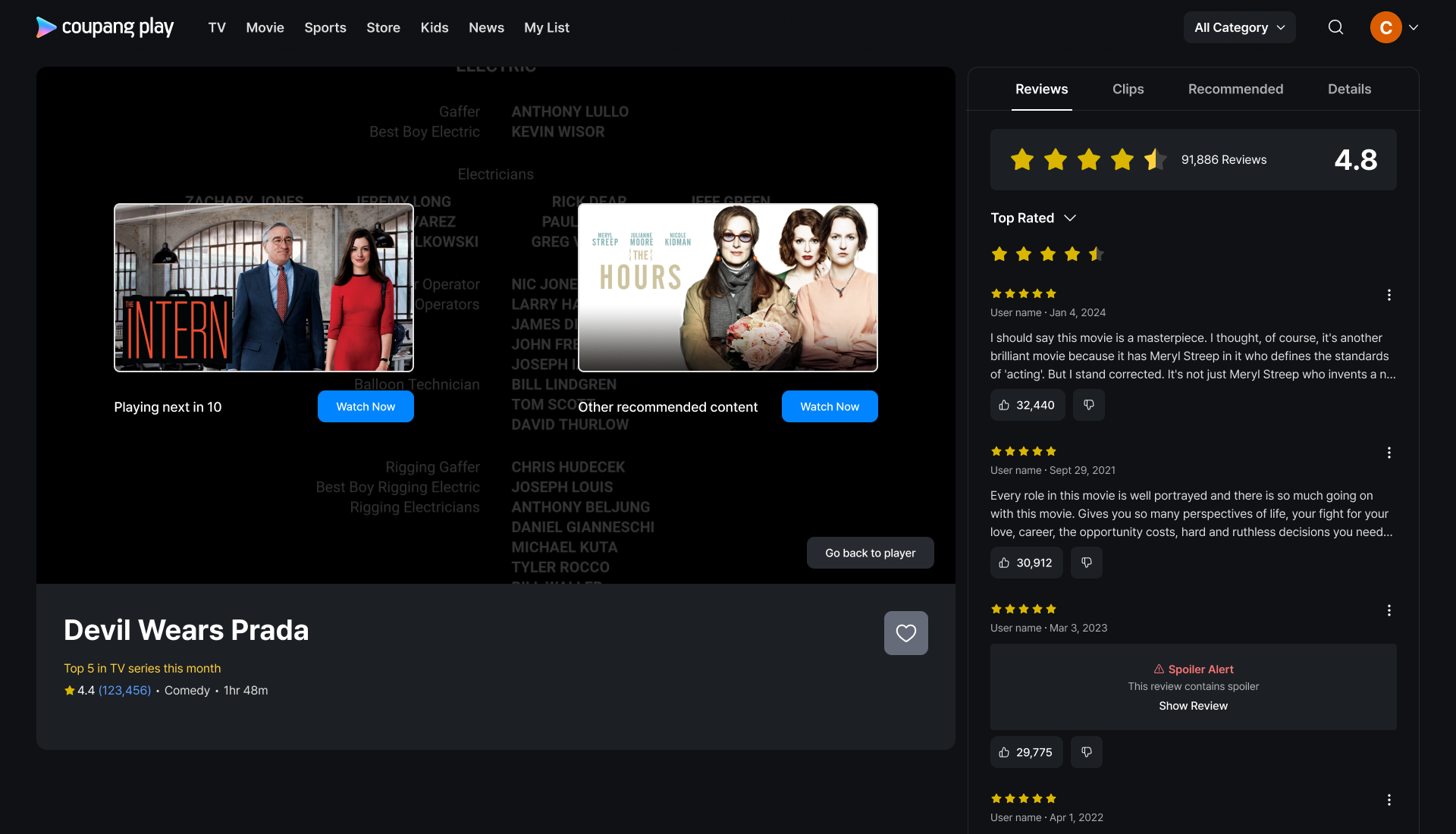
Design A
Hypothesis behind design A is that users find it difficult to choose something when there are two many choices. It becomes easier for users to pick one over another.
First poster gets autoplayed in 10 seconds and users need to click the second poster to play.
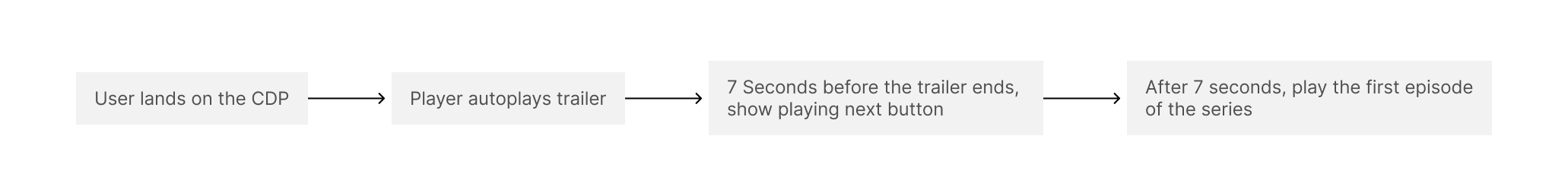
Player autoplays trailer

Show an indicator that user is watching trailer
Show playing next button

Show what is going to play next with the timer animation behind
Auto-play the main content or the first episode

When the first episode plays, highlight the episode that is being played in the episode tab
When user lands on the CDP page, the player continues playing 10 seconds rewinded from where user has left off previously.
This is to recall users memory to help their engagement with the content
Design B
Hypothesis behind design B is that the more choice we provide, higher chance for us to target user’s pick. My concern with this design is that there are too much for users to see and decide with in 10 seconds.
The content that gets auto played next is highlighted at the top of the player in larger size. Other recommendations are in smaller thumbnail underneath as a collection.
TV Series Screens
Movie Screen
TVOD Screen

Users need to go through payment flow before autoplaying the actual content
Does not have the episode tab
When there is a discount, show under the payment CTA
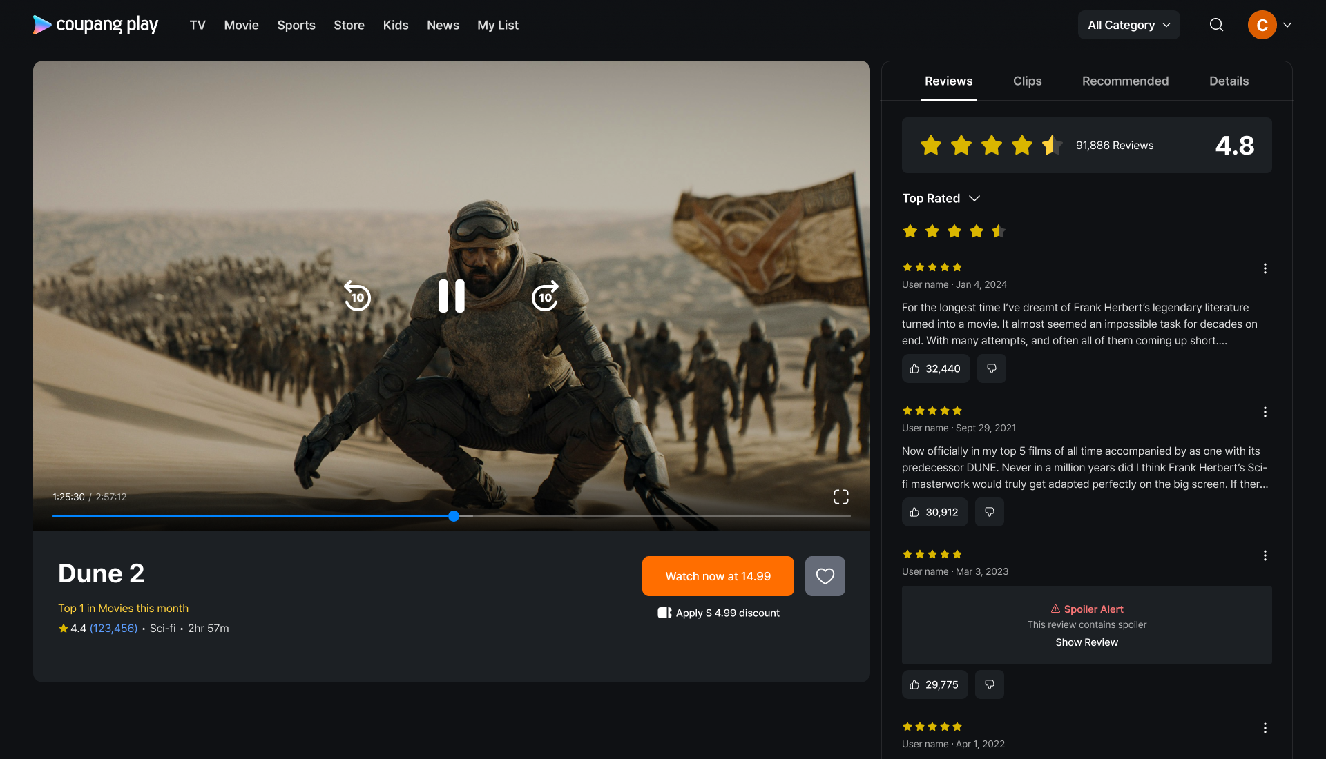
Social Data
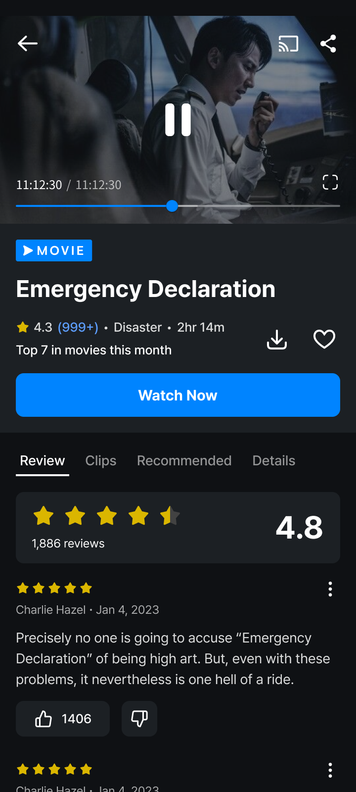
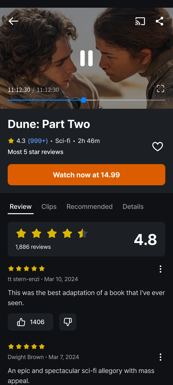
Basic information such as genre, casting, release year and etc are important. Yet what is considered basic today is abit different. People are influenced by other people. That is why review and rating matters, people’s recommendation are considered and how many times video was viewed matters on Youtube.
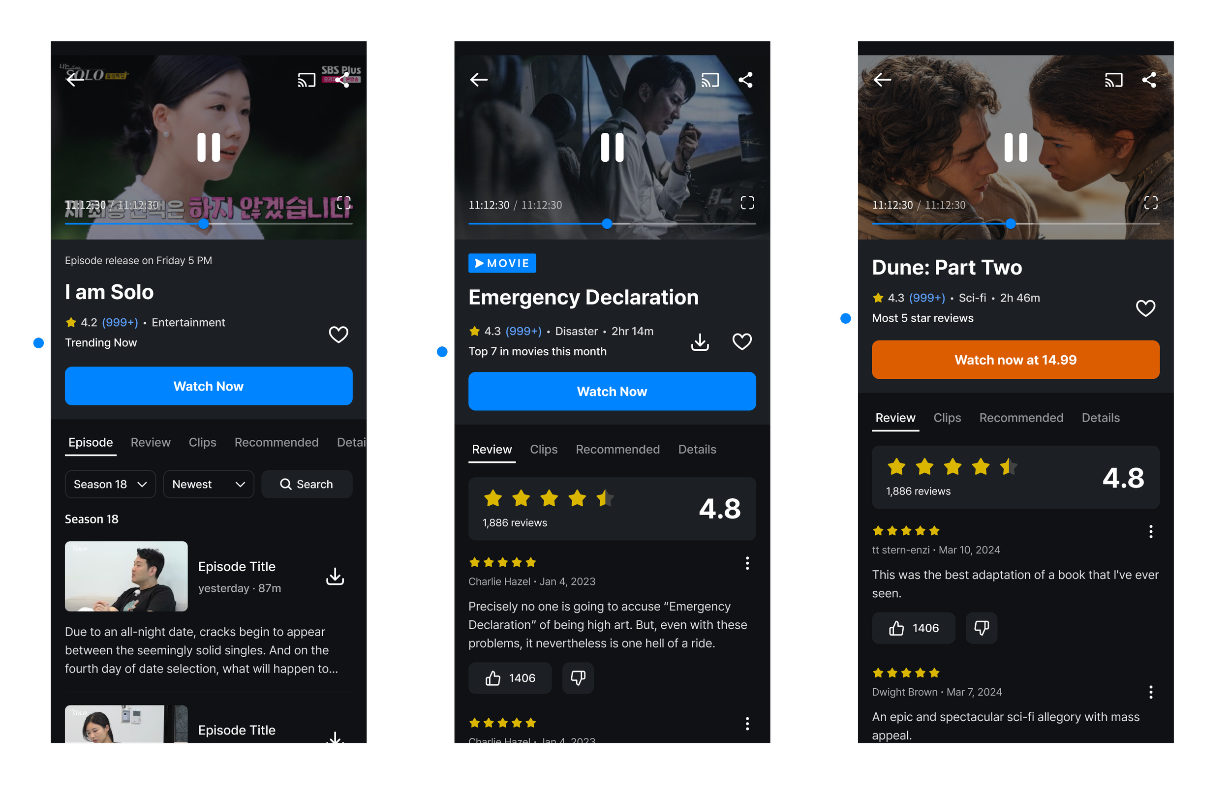
We worked with data engineers and introduced social datas such as
Award Winning
Trending Now
Top 10 in movies/tv series this month
Most 5 star reviews
Most people watched till ending